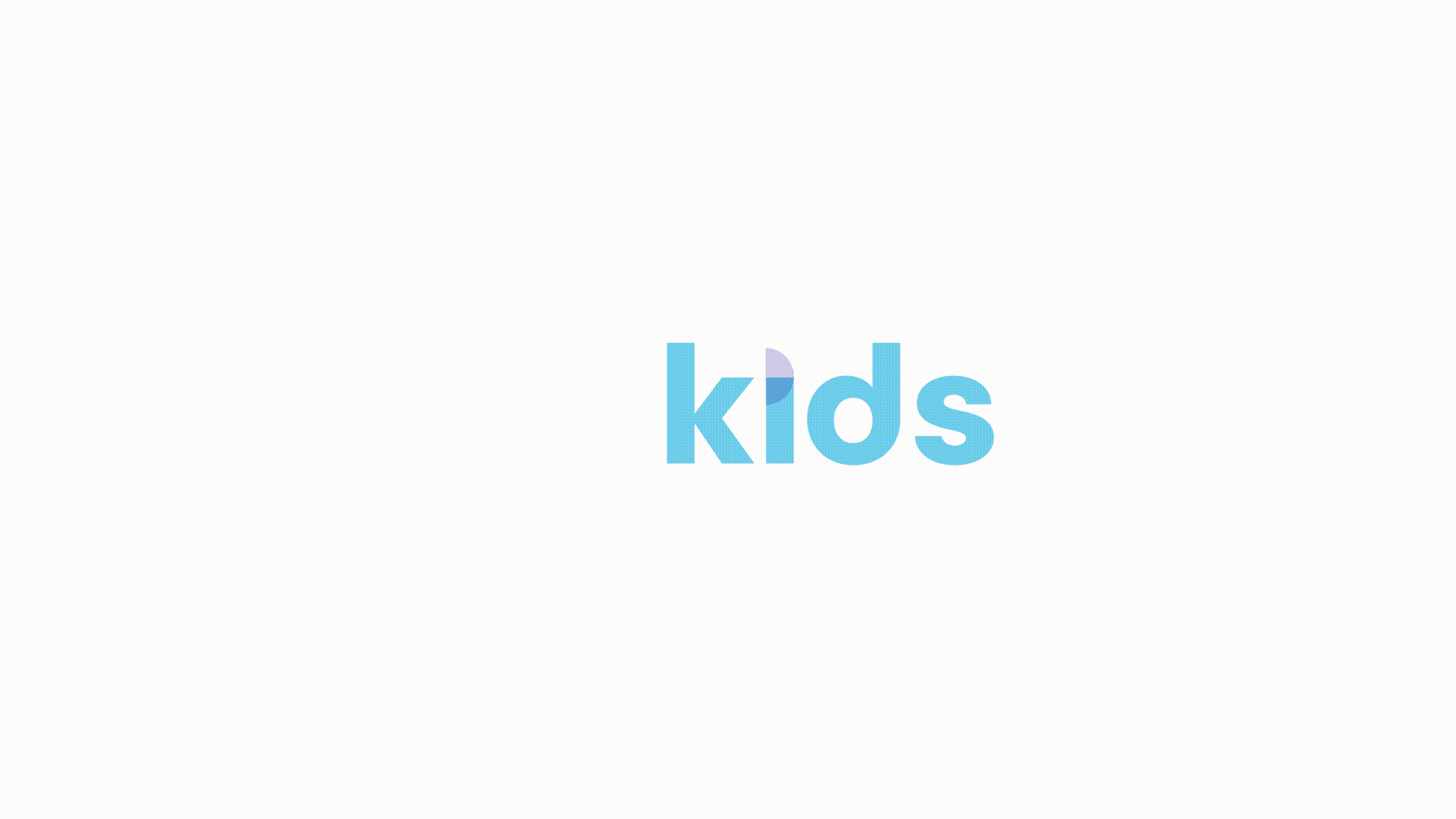
Infiniti Kids
B2C | Market: Singapore | Scope: Branding, Logo creation, Concept ideation, Art Direction, Adaptations from print to digital
Infiniti Sports is a company that offers softball training and coaching privately for individuals as well as in a group. When the founder approached me, he presented me with a real problem.
“I’ve started a sub-company called Infiniti Kids, targeting a whole new target audience,” he said, “And I need help to create a logo for it.”
Infiniti Kids offers various sports trainings and courses to children aged 3 to 8. Some of the sports that they offer includes basketball, softball, track & field and soccer.
THE BRIEF
Infiniti Sports lacked a proper branding, and it was challenging to come out with a sub-company logo that is in line with it. What was important was that the new logo (as well as the main one) does not only serve a strong brand affinity, it also needs to exist cohesively with the main brand. Fortunately, I was given the green light to change and rebrand the main logo as well with one condition – to keep the original blue.
THE CHALLENGE
We’ve decided to revamp the main brand’s logo as well, coming out with a brand mark that will truly be theirs. In that way, both Infiniti Sports and Infiniti Kids’ brand association will be stronger With that, we came out with a new brand mark, something that both the parent and sister company can share.
THE APPROACH

A brand mark born from the word ‘infiniti’
The word ‘Infinity’ means a lot to the founder, especially in the context of sports. To him, sports is infinite. It is also something that keeps on giving. When you teach sports to a generation, they will teach it to the next generation and so forth.

CHOOSING THE TYPEFACE
A rounded typeface was intentionally chosen to match the roundness of the new infinity sign. There is a balance present in this choice of font – it is fun but at the same time it does not compromise on the corporate side of the brand.
THE target audience is important
We understand that the target audience plays a big part in distinguishing the Infiniti Kids brand from its parent company, therefore we acknowledge the big role colours will play in this branding. Infiniti Kids’ main colour is a beautiful shade of sky blue. This sky blue will be used with the darker blue which is the brand’s parent company’s colour. The reason why we are choosing to keep the darker blue is because brand association is important, especially for a new brand. Alongside this sky blue, we came out with a range of accompanying colours that can be used for the various merchandises and collaterals – as long as they do not overpower the main colours.


iconography
We came out with an icon for each sport. Besides being used to represent the respective sports, the icons can also be used in infographics for better information management.


how it looks like on rgb is as important too
Here we showcase how the brand colours and brand mark can be translated to digital.